1. Overview
A responsive website is a concept in the web design industry. Responsive means designing a website with a screen resolution suitable for different devices. Here I will give you a few ways and how to work Responsive web through Angular, React, Vue Js software.
For example: When you are surfing the web to watch the news, sometimes we will rotate the phone horizontally so that the resolution can be wider, which makes the news page more beautiful like a miniature laptop.
2. Framework and Library of Responsive Website
2.1 Angular JS
- Define
Angular JS is a JavaScript web framework created and supported by Google and the community to solve the difficulties encountered during single-page application development, to learn AngularJS first needs to have knowledge of AngularJS. HTML, CSS, JS. In addition, AngularJs provides additional components for Cordova, the framework commonly used to create mobile applications.
- Responsive website with Angular
Angular JS is a Google-based framework that allows you to really expand HTML through responsive web design services and enables you to use HTML as your principal template language. Angular JS is extremely useful in web design services since it is flexible and works well with other libraries as well.
2.2 React JS
- Define
React JS is a JavaScript library for developing user interfaces or UI components, free and open-source front-end. Facebook and a community of individual developers and enterprises maintain it. In developing single-page or mobile applications, React may be utilized as a basis. However, React only deals with government administration and the transfer of the state to the DOM, which requires other libraries and specific client-side functions for the creation of React
- Responsive website with React JS
In a responsive website, React JS is used. CSS media query react can be used or custom reacts hooks can be used to provide the current page size and hide or reveal JSX links.
2.3 Vue JS
- Define
Vue JS is a versatile user interface framework (UI). In contrast to monolithic frameworks, Vue has been built for the step-by-step creation of applications from the ground up. Users just have to utilize the Vue Core Library, easy to understand and connect with existing libraries or projects during the development of an interface class. At the same time, Vue also easily satisfies the demands of single-page apps (SPA – Single Page Applications) with high complexity when paired with current approaches such as SFC and support libraries.
- Responsive website with Vue Js
Responsive design is often wanted for online apps. We must support a range of devices and screen sizes as developers. CSS, HTML, JS is a fantastic tool to utilize basic applications and to execute extremely efficiently. However, even with the use of preprocessors, the management of complicated media queries can become difficult (SASS, PostCSS, LESS, etc.).
Vue.js can decrease the complexity of media request processing and responsive design significantly with the help of the MatchMedia API. It ensures easy interaction with a part-based design that keeps the declarative and semantic approach tidy.
3. Responsive Design Best Practices
Nowadays, smartphone users demand more because it is convenient and easy to carry around, so many people browse the web on their phones for entertainment and news. Optimizing the site for each device to meet user needs here are some must-know best practices for responsive design.
- Screen resolution
Limit the size of a web page on the desktop, there will be a change if the screen is minimized, the information will be broken into sections, can split the text when reading the text.
Using VnExpress International as an example.
 Image 1: Website vnExpress ( Source:https://e.vnexpress.net/)
That’s for desktop but also for mobile devices make sure this section is rearranged and doesn’t increase the length of the page
- Font size balance
The size of the headers to the text of the paragraphs should be balanced. Large headers on mobile do not look well, particularly if the headers span a few lines. All should be properly scaled.
New mobile devices have high-resolution displays, making text simpler to see and read. On mobile screens can be a bit smaller and the text sizes can be increased when the display is bigger.

Image 2: Website Nike ( Source: swoo.sh/3uESP48)
Using the Nike website as an example it can be seen that when using a mobile device the arrangement is different from that of a desktop computer. Font size and image, swapping buttons
- Hide content when minimizing screen
On mobile devices, the layout can be simplified by concealing material seen on big displays, either by entirely hiding it or by employing taps and accordions to display/hide content. This declutches the page on smaller displays and allows the user to see all essential information.

Image 3: Website Christian Louboutin ( Source: http://us.christianlouboutin.com/us_en/)
As an example I’m going to use this site to demonstrate, it can be seen that on mobile devices a lot more content is hidden than on desktop screens.
- Responsive Videos
This procedure enables video of any size to automatically react to the device size without explicitly setting video heights or widths.
Only a few lines of CSS are achieved. This functions quite well with videos directly put in iframes and on the page.
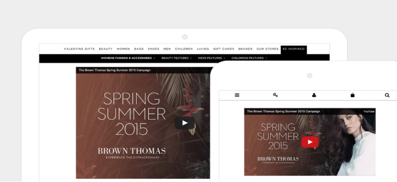
Image 4: Website Christian Louboutin ( Source: https://www.brownthomas.com/)
Brown Thomas’s linked video uses iframes and reacts completely. There are no fixed heights or widths that allow easy administration and rapid generation of page content.
If you would like to have a good website for your users, all of this is necessary. Half the traffic of your website may come from mobile phones; it isn’t a way to alienate them by providing them a mobile interface.
You will be able to assess whether or not your Website is fitted with the current, mobile-first era in which we live, by examining your site in the context of these responsive design best practices.
4. Conclude
It is up to each developer’s knowledge to utilize Frontend Framework to enable Responsive Web. AngularJS, React JS, Vue JS all have their own advantages and disadvantages. This implies that product development should be made for all cases exclusively.
Source:
https://www.incomediary.com/best-practices-responsible-responsive-web-design/
https://www.impactplus.com/blog/responsive-design-best-practices
https://www.freecodecamp.org/news/make-react-apps-responsive/
https://en.wikipedia.org/wiki/React_(JavaScript_library)
https://vi.wikipedia.org/wiki/AngularJS
https://vi.wikipedia.org/wiki/Vue.js
https://www.digitalocean.com/community/tutorials/vuejs-vue-media-queries